What Makes A Good Black and White Image? | Boston Photographer
May 4, 2021
When a photographer first starts a business, there is a lot of thought and effort put in to perfecting color edits. This makes sense because *most* clients, when polled, prefer color images. Because there is less focus on black and white editing, less people understand the key components to an eye-catching edit. Let’s talk about the three things I look for when deciding to convert images in a gallery.
Emotion is a key component of a black and white edit.
Removing the colors in an image serves to focus the viewer on what is happening in an image. If the image is a traditional portrait with everyone looking and smiling, it doesn’t make you FEEL anything. I believe that using black and white on a traditional portrait leaves the viewer wondering what it looked like in color! I look for images that I can purposely remove color because it’s not important to the story. For me, it doesn’t matter what the emotion is: joy, intimacy, sadness…all these emotions can be enhanced by removing color. I end up converting about 25% of my galleries and you’ll find many of these emotive images in my galleries.
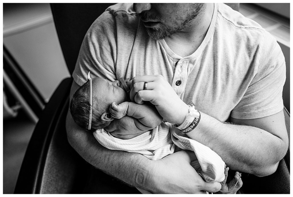
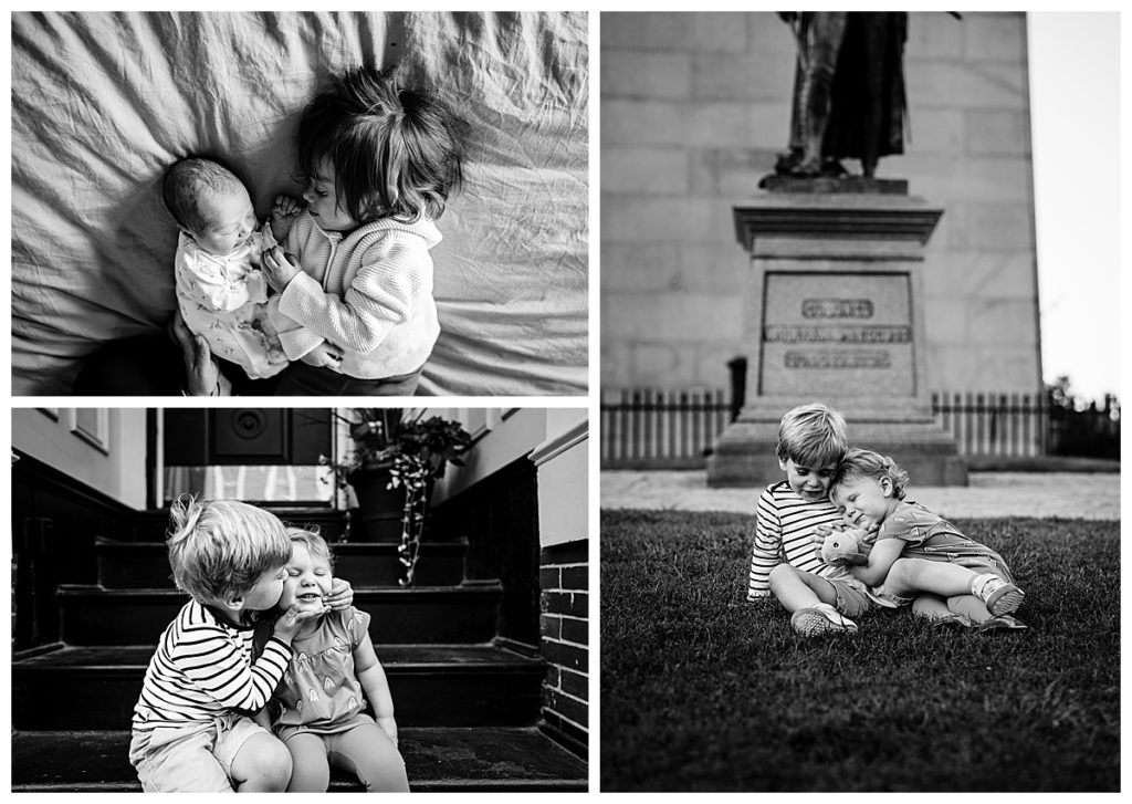
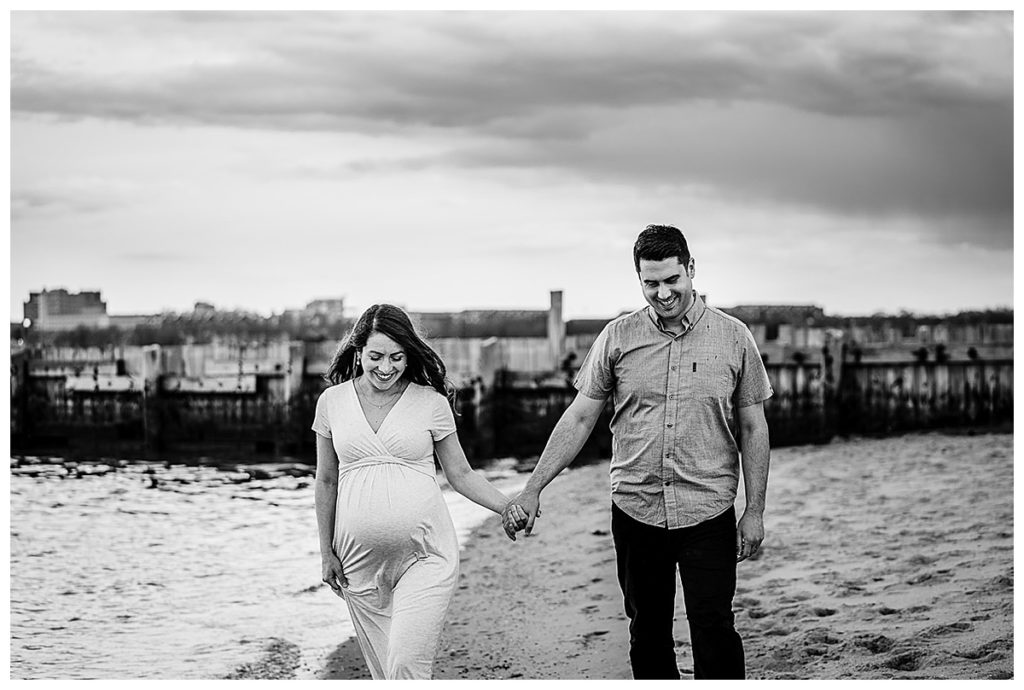
A Good Black and White Imaged Has High Highlights and Deep Blacks
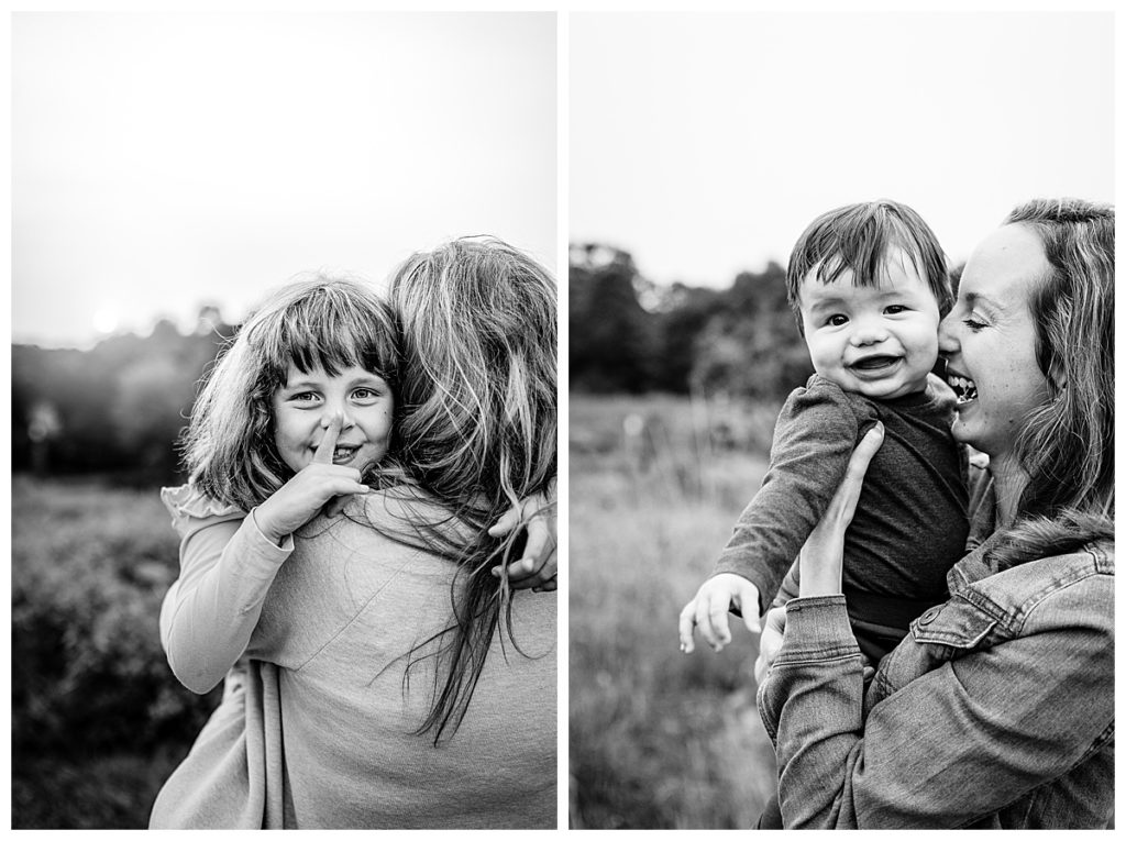
What exactly does high highlights and deep blacks mean? It translates to “images that have a lot of contrast”. For those who are not photographers: I am looking for images that have very bright areas and also very dark areas. When there is not enough contrast, a black and white conversion looks sort of grey all over and really falls flat. In the images below, you can see how there are many different shades of black, white, and grey. When you don’t have color helping to focus the viewer’s eye, you need highlights and shadows!
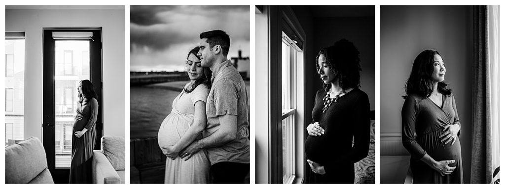
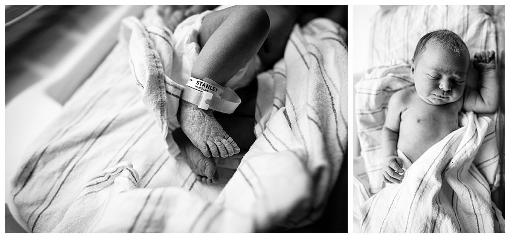
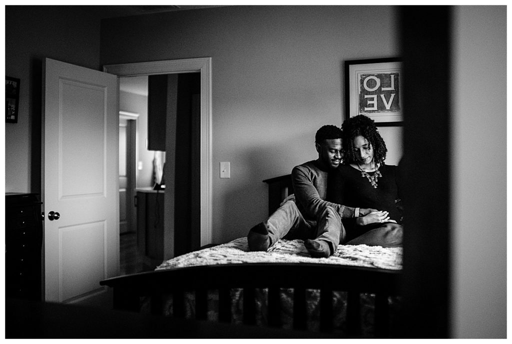
Removing Color Removes Distractions
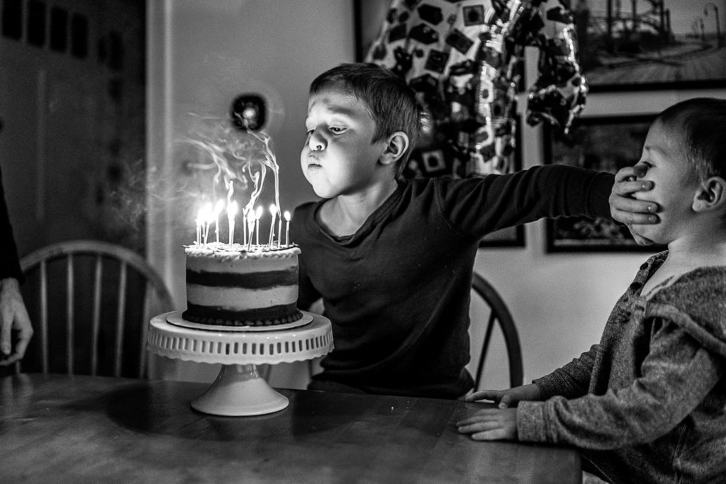
Last, but definitely not least, when choosing good conversion images it’s important to remember that removing color removes distractions. In this image, my oldest was SO mad that his little brother was trying to blow out his birthday candles that he pushed his face away. It was a pure documentary moment which meant that there was a LOT going on. Different color shirts, artificial lighting, a multi-colored balloon in the backdrop. All of these things were taking the viewer’s eye away from the moment. Black and white can help eliminate distractions and focus you in on the moment.
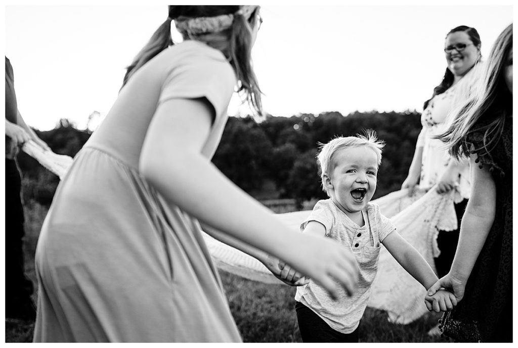
In this image below, this little boy’s sweet face was getting lost in the frame. His sister’s pink dress, the green grass, his other sister, and his parents were all distractions. Removing all of that helps your eye go straight to his amazingly joyful expression.
So, what are you waiting for? Go convert some images! To see more of my favorite black and whites, check out my website and instagram!
Leave a Reply Cancel reply
"To say that I love each one would be cliche and a total understatement, but seriously... She nailed it. Being a photographer myself, I am very picky and searched dozens of photographers before coming back to lyndsay and booking her and I am so glad I did. I can't even remember the last time I hired a photographer and was this in love with the images and unable to pick just a few favorites. Thank you, lyndsay, for making the photo session easy (with 3 kids), fun and providing this mama memories for a lifetime.”
- laura, boston
Paragraph
"Our images are so special and really captured our joy and the sweet personality of our little girl. Lyndsay did a great job going beyond the typical posed shots and making our photos feel authentic. We will treasure them forever."
- amanda, northborough
"We have done multiple sessions (family and newborn) and we’re so happy with the results. Lyndsay makes you feel comfortable and is able to truly capture the moment. We will have her prints hung in our house for years to come."
- beth - framingham
"We've done it all - newborn, maternity, cake smash, family photos - and every single time we are amazed by the quality of the end product. Lyndsay captures beautiful moments that we will treasure forever!"
- nicole - framingham
Based in Framingham and serving the heart of the MetroWest Suburbs—from sun-drenched living rooms in Southborough and Wayland to backyard adventures in Sherborn, Sudbury, and Natick.
view portfolio
sign up for exclusive session updates!